

Our portfolio
At Oak & Morrow, we believe in intentional, timeless design that roots your brand in quality and helps it grow toward the future. Explore our portfolio showcasing our artisan-crafted work, particularly our flyers, designed to foster community closeness and engage local interest in Wingham, Ontario.
Discover our authentic flyer designs
Dive into our collection of authentic, artisan, and wonderfully imperfect flyer designs. Each project reflects our tactile, human-centric approach, aiming to evoke a sense of community closeness and genuine engagement. We're proud to showcase how our designs help businesses stand out with established, professional reliability.
How our flyers foster community closeness
One of our favourite projects involved designing flyers for a local Wingham initiative focused on community closeness. The client aimed to engage local residents and encourage participation in neighbourhood events. We created designs that were not only visually appealing but also resonated with the authentic spirit of the community, using bespoke illustrations and thoughtful messaging. The result was a highly effective campaign that significantly boosted local engagement, proving the power of intentional, human-centric design.
View our latest work
Discover our collection of creative work and visual projects. Each piece showcases our attention to detail and commitment to delivering results that exceed expectations.
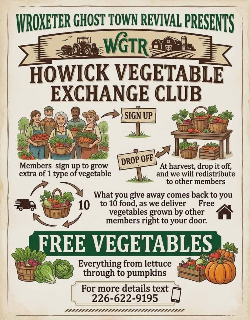
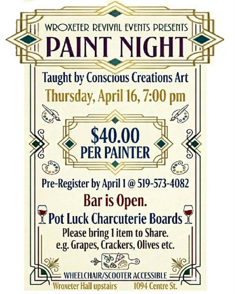
One of our very first clients, Wroxeter Ghost Town Revival Events, is a passionate community group dedicated to bringing new life to the historic Ghost Town of Wroxeter. Our flyers support their mission by helping promote local events, boost community engagement, and shine a spotlight on the unique heritage of this small but mighty town.
Event Announcement Flyer Created to promote an upcoming community event in Wroxeter, this flyer highlights key details such as date, time, and location while capturing the spirit of the Ghost Town Revival movement. Its purpose is to attract residents and visitors, encouraging participation and community pride.
Fundraiser or Donation Flyer Designed to support fundraising efforts for restoration or community projects, this flyer focuses on raising awareness and inspiring contributions. It communicates the importance of preserving Wroxeter’s history and outlines how supporters can get involved.
Seasonal or Holiday Event Flyer This flyer showcases a themed event hosted by the Revival group — from holiday gatherings to seasonal celebrations. Its purpose is to bring the community together, create memorable experiences, and keep local traditions alive.
Volunteer Recruitment Flyer Created to help the group grow its volunteer base, this flyer explains the roles available, the impact volunteers make, and how to join. Its purpose is to strengthen community involvement and support ongoing revitalization efforts.
Heritage or Historical Feature Flyer This flyer highlights a piece of Wroxeter’s history — a building, landmark, or story. Its purpose is to educate the community, spark curiosity, and deepen appreciation for the town’s heritage.
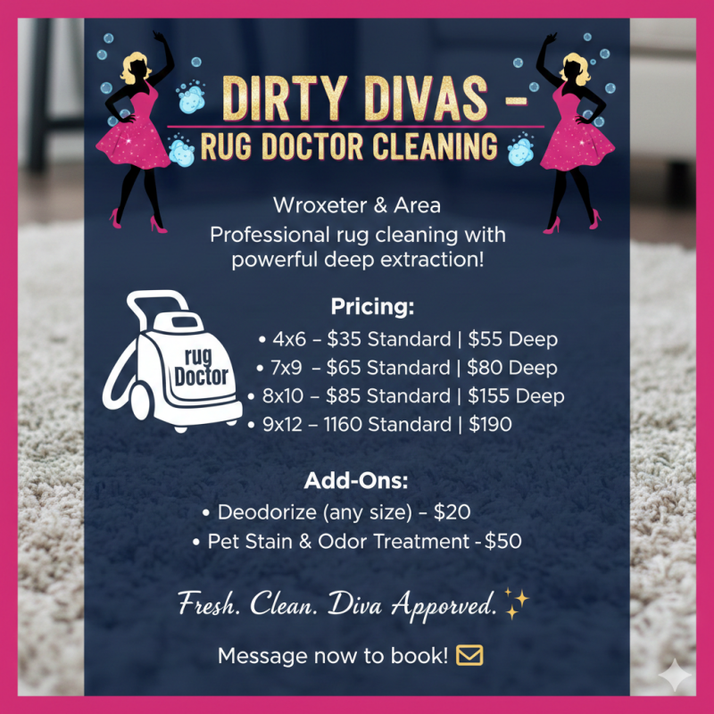
This flyer was created for a small start‑up cleaning business, Dirty Diva’s Rug Doctor Cleaning. The goal of this design was to help a new entrepreneur establish a strong, trustworthy presence right from the start. The flyer highlights the services offered, showcases the brand personality, and provides clear contact information to attract first‑time customers.
Its purpose is simple: to help a new business stand out, look professional, and confidently reach its local audience.
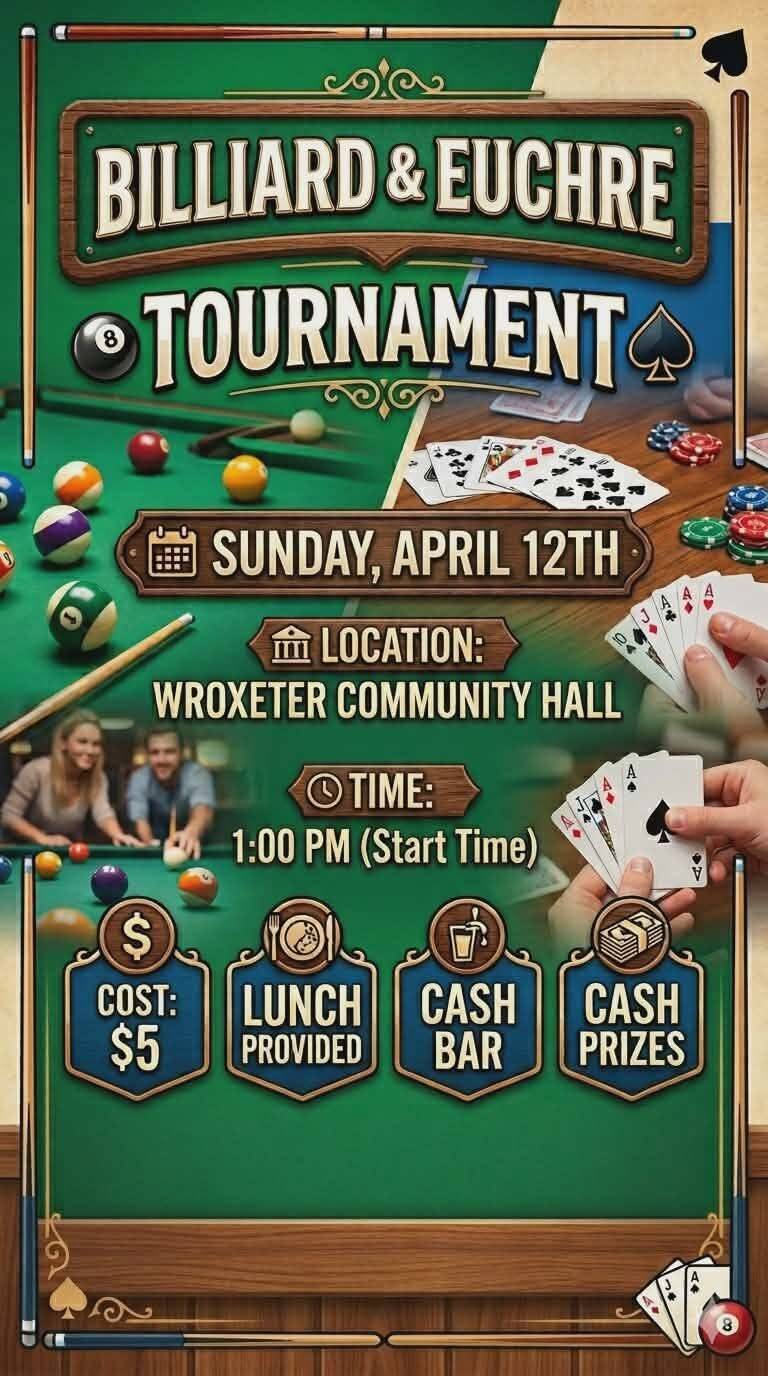
Local Billiard & Euchre Tournament – Event Flyer
This flyer was created to promote a community billiard and euchre tournament hosted at a small town hall. Its purpose was to generate excitement, share key event details, and encourage local residents to come together for a fun, friendly competition. The design focuses on clarity, approachability, and a welcoming community feel — helping boost attendance and support for local events.
The following are some mockups we are working on!
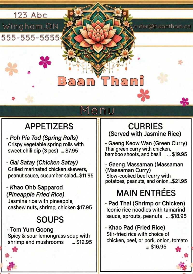
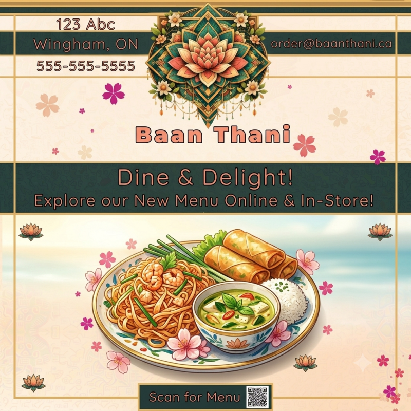
Case Study: Baan Thani Menu Architecture
**The Objective:** To design an elegant, highly scannable, and culturally resonant menu framework for a fictional boutique Thai restaurant called *Baan Thani* (123 Abc, Wingham, ON). The goal was to take traditional Southeast Asian cultural motifs and translate them into a clean, modern layout that minimizes cognitive load for hungry diners while maintaining a premium brand identity. Think Art deco meets geometry.
🛠️ Design Decisions & Rationale
1. Grid Structure & Layout Economy (The Dual-Column Blueprint)
* **The Choice:** A rigid, symmetrical two-column grid framework.
* **The Strategy:** Standard restaurant menus often overwhelm customers with dense walls of text. By partitioning the layout into two distinct vertical columns, the menu creates an instant behavioral pathway: lighter starters and soups occupy the left, while rich curries and main dishes anchor the right. This allows the diner's eye to categorize choices in fractions of a second.
2. Branding Anchoring & Visual Hierarchy
* **The Choice:** A centrally aligned, intricately detailed lotus mandala emblem at the absolute top of the page.
* **The Strategy:** The lotus flower and mandala geometry pay homage to Thai heritage and hospitality. By placing this high-contrast, multi-layered graphic at the crown, it acts as a visual anchor. The restaurant name, contact details, and order email flank the emblem in a balanced top-third header, keeping crucial business information accessible without encroaching on the food selections below.
3. Whitespace & Text Contrast
* **The Choice:** Soft, patterned cream background (#F9F8F6 aesthetic) paired with high-contrast coral headers and dark charcoal text.
* **The Strategy:** To balance the ornate complexity of the top mandala and the playful pink blossom accents scattered across the page, the main content canvas relies heavily on negative space. The spacious margins give the text room to "breathe," ensuring that the customer's eye is drawn strictly to the food names and descriptions, avoiding visual fatigue.
4. Typography & Copywriting Synergy
* **The Choice:** Bold, blocky title typography for the menu headers paired with a clean, highly readable sans-serif for item descriptions.
* **The Strategy:** The primary dish names utilize phonetic Thai naming conventions (*Poh Pia Tod*, *Gaeng Keow Wan*) to preserve cultural authenticity, immediately followed by clear English translations in parentheses. Descriptions are kept to exactly one line, focusing on key flavor profiles and star ingredients (e.g., *tamarind, lemongrass, wild forest honey*) to drive appetite appeal quickly and concisely.
💡 Portfolio Takeaway
This project demonstrates my proficiency in asset layout optimization, structural grid systems, and brand-aligned UX writing. It proves I can take a vibrant, complex cultural identity and discipline it into a highly functional, readable, and commercially viable print or digital asset.
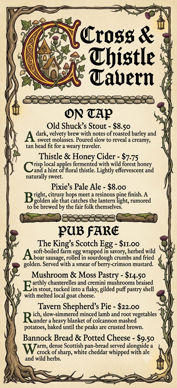
Project Case Study: The Cross & Thistle Tavern
**The Objective:** To design a high-concept, highly immersive menu asset for a fictional local pub that seamlessly blends the historical gravity of an **illuminated medieval manuscript** with the whimsical, organic details of a **folklore fairy village**.
The goal was to prove that a heavily stylized, themed menu can remain perfectly legible and structured without losing its magical world-building
🛠️ Design Decisions & Rationale
The Blueprint & Layout (5.5" \times 12"):By opting for a long, narrow single-panel aspect ratio, the menu breaks away from standard modern restaurant formats. The proportions purposefully mimic an ancient parchment scroll or a heavy, leather-bound card, immediately setting a rustic, historical tone the moment a guest "picks it up."
The Monastic Drop Cap ("C"):Serving as the visual anchor of the branding, the oversized capital **C** acts as a nod to traditional monastic scribes. To inject the "fairy village" theme organically, the letter's curves are interwoven with hand-drawn elements—micro mushroom caps, climbing ivy, and hidden fairy architecture—illuminated in a glowing marigold (#F2B705) to draw immediate focal attention.
Hand-Inked Organic Framing:nTo lean away from sterile, sharp digital layouts, the borders were designed as thick, creeping tree roots that morph into thorny thistle vines. Hanging lanterns tucked into the corners add depth and a sense of cozy, atmospheric lighting directly on the page.
Thematic Section Dividers: Instead of using standard digital geometric lines to separate the "On Tap" and "Pub Fare" sections, I illustrated literal rows of cobblestones and mossy logs. This reinforces the "forest path" narrative, guiding the customer's eye through the menu sections as if they are exploring a village.
Color Strategy & Contrast Control: Background (#F2EAD3): An antique, grainy vellum texture provides a warm, low-glare backdrop that feels aged but clean.
Typography Hierarchy:The headings utilize a bold, stylized Gothic Blackletter to capture the tavern's old-world gravity. To counter the heavy headers, the body copy is set in a highly legible Old Style Serif (*Garamond/Caslon* style) using a deep ink charcoal (#1C1A1A) rather than pure black, ensuring the text feels naturally inked rather than digitally stamped.
The Forest Green Accents (#1E3525): Highlighting the first capital letter of each dish description in deep mossy green creates a rhythmic reading pattern, letting the user scan options smoothly.
💡 Portfolio Takeaway Tip
This project showcases my ability to execute deep, highly specific thematic world-building while maintaining a strict adherence to typography rules, legibility, and user-experience hierarchy.
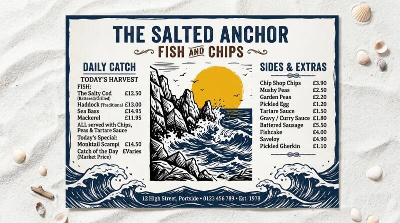
Case Study: The Salted Anchor Placemat Layout
**The Objective:** To design a spacious, high-contrast landscape placemat menu (14" \times 8.5") for a premium, casual seaside venue called *The Salted Anchor Fish & Chips*. The creative challenge was to capture the refreshing, sun-drenched atmosphere of a rugged Atlantic coast while structuring a three-column grid that functions perfectly as an interactive table placemat.
🎨 Design Decisions & Rationale
1. The Landscape Three-Column Blueprint
* **The Strategy:** Unlike vertical trifold menus, an interactive table placemat demands instant horizontal scannability. The composition separates content into three distinct spatial regions:
* **Left Column (The Daily Catch):** Prioritizes the high-margin, core seafood offerings.
* **Center Column (The Visual Core):** Dedicated entirely to brand artwork, providing visual breathing room so the text never feels cramped or overwhelming while a guest is seated.
* **Right Column (Sides & Extras):** Groups complementary add-ons and snacks, facilitating quick upsells.
2. High-Contrast Coastal Color Palette
* **Background — Crisp White Sand (#F9F9F6):** Provides a warm, radiant, and ultra-clean canvas that evokes summer sunlight reflecting off dry beach sand.
* **Primary Text — Dark Navy Blue (#0F1C26):** Replaces clinical pure black with a rich maritime hue to anchor the typography with excellent readability under bright restaurant lighting.
* **Thematic Accents — Sun-Bleached Ochre (#F0A85D):** Applied strategically to dividers, subheaders, and the iconic solar focal point to add warmth and simulate an intense summer afternoon.
3. Woodcut Centerpiece & Organic Borders
* **The Strategy:** The center column contains an imperfect, hand-drawn woodcut illustration of jagged gray coastline rocks jutting out into a deep Atlantic blue sea (#1C3144). By keeping the sky completely open and white, the layout inhales "breezy" negative space.
* **The Border Break:** Rather than containing the graphic elements inside an artificial bounding box, the illustrated sea waves fluidly break across the absolute bottom edge of the paper. This organic flow makes the menu feel alive, crafted, and distinctly non-corporate.
4. Typography Hierarchy & Currency Formatting
* **Titles:** Set in a heavy, weathered serif font reminiscent of old shipping crates, weathered dock signs, and traditional nautical transport.
* **Body Copy:** Set in a clean, crisp, ultra-legible sans-serif to maximize reading speed.
🍽️ Featured Menu Structure
**Daily Catch (Left)**
* **Atlantic Haddock & Chips — $16.50** *Crisp, flaky haddock in our signature golden batter, served with house tartar and sea salt fries.*
* **Gloucester Cod & Chips — $18.00** *Thick-cut North Atlantic cod, line-caught, double-fried for maximum crunch. Served with lemon.*
* **Coastal Rockfish Bites — $14.75** *Crisp bite-sized rockfish nuggets dusted in Old Bay seasoning with spicy remoulade.*
* **The Captain's Platter — $24.00** *A generous feast of golden haddock, wild shrimp, and sea scallops with a double portion of chips.*
**Sides & Extras (Right)**
* **Triple-Cooked Chips — $5.50** *Thick cut Russet potatoes, sea-salted and served with malt vinegar.*
* **Classic Mushy Peas — $4.00** *Sweet marrowfat peas simmered with a touch of butter and fresh mint.*
* **Creamy Coastal Coleslaw — $3.75** *Shredded cabbage and carrots tossed in a tangy, bright celery seed dressing.*
* **Crisp Onion Rings — $6.00** *Jumbo sweet onions in our signature light beer batter.*
💡 Portfolio Takeaway
This piece highlights my capacity for horizontal spatial management, intentional print formatting, and thematic color balancing. It demonstrates that commercial layouts can embrace bold artistic elements while maintaining flawless type contrast and usability.